

Overview
In this lesson, science educator, Chris Powley, and math educator, Dominic Goulette partner with the Great Lakes Observing System (GLOS) to create a unique data-driven learning experience for students. Using GLOS data collected from buoys deployed in Lake Huron, students discover connections that help them understand harmful algal blooms in the Great Lakes.
Students will consider how human land use impacts adjacent waterways. They will consider harmful algal blooms, hypoxia and observational buoy data collection and graphing. Students will also have the opportunity to apply their discoveries to their local watershed.
Photo Credit: Michigan Sea Grant
Alignment
- Michigan Science Standards Performance Expectation(s)
- HS-LS2-2: Use mathematical representations to support and revise explanations based on evidence about factors affecting biodiversity and populations in ecosystems of different scales.
- HS-LS2-6: Evaluate claims, evidence, and reasoning that the complex interactions in ecosystems maintain relatively consistent numbers and types of organisms in stable conditions, but changing conditions may result in a new ecosystem.
- HS-LS2-7: Design,evaluate and refine solutions for reducing the impacts of human activities on the environment and biodiversity.
- Common Core Math Standards
- 8.SP: Investigate patterns of association in bivariate data
- 8.F 4 & 5: Use functions to model relationships between quantities
- Great Lakes Literacy Principles
- Principle 5- The Great Lakes support a broad diversity of life and ecosystems.
- Principle 6- The Great Lakes and humans in their watersheds are inextricably interconnected.
- Principle 7- Much remains to be learned about the Great Lakes
Lesson Logistics
Title: Buoy, Is That Water Green! How do our local land use practices impact life in the Great Lakes?
Driving Question: How do local land use practices impact life in the Great Lakes?
Anchoring Phenomenon: Exploring the connection between local practices, harmful algal blooms, and life in Lake Huron.
Great Lakes Topic: Harmful Algal Blooms (HABs)
Essential Questions:
- What are harmful algal blooms (HABs) and what conditions can lead to their formation?
- How do HABs impact life in and out of the water?
- What is observational data?
- How might our land use practices impact water quality
Learning Objectives: Students will be able to
- describe Harmful Algal Blooms (HABs) and the impacts they have on a watershed,
- determine how human activity can contribute to HAB formation and hypoxic conditions,
- analyze water quality data generated from buoys deployed in the Great Lakes,
- share insights about land use with others.
3-P Learning Goals: Students will
- identify negative impacts on a watershed as a result of Harmful Algal Blooms,
- analyze data to determine the health of local bodies of water,
- collect water quality data in a local watershed,
- present findings on how local land use practices impact water quality to local entities.
Data Profile:
- What: Observational data from buoys
- Data Collection Date: 2022
- Source: Great Lakes Observing System
Photo Credit: Ohio Sea Grant
Materials
Access printed copies or electronic versions of lesson materials below.
Engagement Photo
Michigan Sea Grant
ESRI Integrated Map
Provide digital access for each student.
Driving Question Board Student Page
One per student
“Buoy, is that water green!” Exploration One Student Page
One per student
ArcGIS Story Map
Provide digital access for each student.
“Buoy, is that water green!” Exploration Two Student Page
One per student
Great Lakes Observing System (GLOS)
Web Resource
Slow Reveal Slides
Reveal one slide at a time.
Learn about Slow Reveal Graphs
Web resource for educators
“GLOS Graphical Analysis Group Activity” Student Page
One per student
“Michigan GLOS Data Analysis Independent Practice” Student Page
One per student
Dissolved Oxygen and Temperature Fact Sheet
One per student
Pond and Stream Study Guide Interpreting Physical & Chemical Factors
One per student
EPA’s “How’s My Waterway?”
Web Resource
Saginaw Bay GIS Map
Provide digital access for each student.
“Status of the Lower Food Web in the Offshore Waters of the Laurentian Great Lakes”
Web Resource
GLOS Use of buoys on the Great Lakes
Web Resource
GLERL Buoy Prep1
Video for buoy deployment.
“Buoy, is that water green!”
Full Lesson PDF
1 Disclaimer: The linked YouTube video below may contain advertisements that can interrupt viewing. Content creators or YouTube typically place these ads, varying in length and frequency.
Time Required
This lesson may require 5 or more class periods. There is an optional opportunity for students to collect local water quality data that may require additional planning and coordination.
Introduction
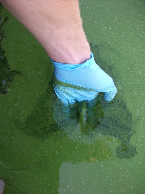
Harmful algal blooms, or HABs, happen when a type of bacteria called cyanobacteria grows too quickly in lakes and rivers. Cyanobacteria are usually harmless, but when they multiply significantly they can create a bloom that can be dangerous for people and animals. In this lesson, students will determine how human activity can impact the growth and spread of HABs. The lesson will continually focus on our driving question: “How do our local land use practices impact life in the Great Lakes?” We have included a “Driving Question Board” in the teacher resource section of this lesson. Students can use this board as an independent reflection tool, and teachers can use it for whole-class debriefing periodically throughout the lesson.
Students will analyze buoy data and describe how it helps us understand water quality and make predictions about future HAB events. They will also explore the Rifle River watershed (connected to Saginaw Bay, Lake Huron) and explain how human activities can impact water quality in that area. Students will generate and communicate generalizations about how land use can impact bodies of water based on their learning.
Lesson
Engage
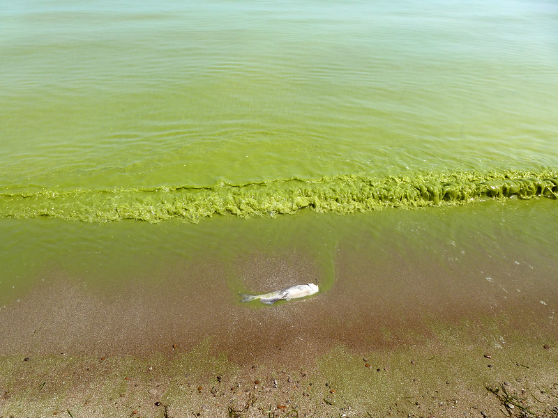
Students examine a photo of water that is bright green. The camera zooms in on a dead fish that has washed up on the shore. The bright green color of the water is an indication that a harmful algal bloom has occurred. The photographer took this photo in one of the Great Lakes, capturing a Channel Catfish (Ictalurus punctatus).
Without mentioning the phrase “harmful algal bloom”, use the photo to facilitate a “whole class” discussion with students. The following prompt and questions can help guide the discussion. Record student answers on a whiteboard, chart paper, or digitally. Organize the discussion notes into a “Think, Notice, Wonder” chart. Save or photograph these notes to review at the completion of the learning cycle.
- Describe what you see in the photograph.
- What questions come to mind when looking at this photo?
- Why do you think the water is green?
- Why do you think the fish in the photograph appears to be dead?
- Have you seen similar water conditions near you?
- How can we learn more about what is happening in this photograph?
Explore
Explore Part One
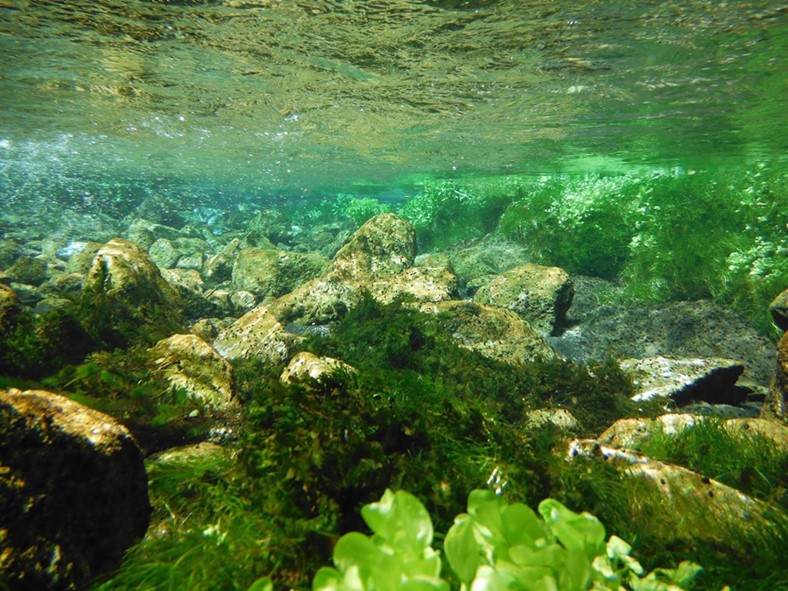
The “Explore” phase of the learning cycle has been written in two parts. We will be using an ESRI integrated map for part one as we conduct a “guided exploration” with students. Our goal for this activity is to provide students an opportunity to discover the relationships between land use, nutrient loading, harmful algal blooms and hypoxia.
Your role as the learning facilitator will allow students to slowly and deliberately discover these relationships in a low stakes environment. We have created a student worksheet to enable students to record their initial thoughts and rework them as they continue to learn. The worksheet can also be used for students who miss class during the guided exploration. The educator instructions below are paired with the student worksheet entitled “Buoy, is that water green! Exploration One”, so the instructor can guide the exploration.
Although the map used in the exploration will ultimately have students looking along the coast of the United States, we take every opportunity to draw attention to the Great Lakes.
- Provide students with the Map URL located in materials as well as a copy of the student worksheet entitled “Buoy, is that water green! Exploration One”.
- Allow students a bit of time to become familiar with the map.
- Begin with the following focal question: What types of land cover are distributed across our country and around our Great Lakes?
- In the upper left corner of the map, the “Details” button will show types of land cover.
- Ask students, “What types of land cover do you notice covering the United States?” [Answers may include: Agriculture in the plains of the Midwest, and forests in the mountains and near coasts.]
- “What types of land cover do you notice around the Great Lakes?” [Answers may include Agriculture, Woody Wetlands, and Urban areas].
- With the Details pane visible, click the button, “Contents” to show the contents of the map. The “Contents” button is the middle icon under the “Details” button.
- Click the checkbox to the left of the layer named “World Hydro Reference Overlay”.
- Allow students time to zoom in and out to analyze the rivers in the United States and Canada. The zoom tool is inside the map in the upper left corner.
- Ask students to name a few of the major rivers in the United States. [Answers may include Colorado, Mississippi, Missouri and the Ohio River.]
- Instruct students to use the zoom tool so they can see dotted brown lines on the map. Ask students what they think the brown dotted lines represent. [These lines represent the major watershed boundaries in the United States].
- Ask students which major river seems to have the largest amount of land in its watershed boundary? [The Mississippi River]
- Ask students to trace the Mississippi River and identify the body of water it ultimately drains into. [The Gulf of America]
- At this point, students need to think about the term “runoff”. Make sure students are familiar with this term as this may be the first time they’ve thought about it. Ask students to think about the runoff that occurs from the land in the watershed to the river and to a larger body of water. What types of material could be part of the runoff that ultimately ends up in a larger body of water. [Answers may include: sediment flows, chemical runoff, and many types of pollution or marine debris.]
- Ask students to look back at the major rivers they identified on the map. What type of land cover do these rivers seem to flow through? If students need to look at the land covers again, they can click on the third button to access the “Legend”. [Answer should be: Agricultural]
- At this point, students need to recall that fertilizer application is a common practice in yards, golf courses, and large-scale agricultural farms. The excess nutrients from fertilizer application can runoff into the local watershed. Make sure students have the “Contents” pane of the map open and ask them to turn on the layer named “GLDAS Runoff”.
- Ask students what they think the darker blue colors represent? [The dark blue colors indicate the higher amounts of runoff. This can be verified using the “Legend”.]
- Ask students if they notice any patterns related to high levels of runoff? [There are higher amounts of runoff near larger urban areas. Students may need to zoom in to test this against cities they know. Provide them time to do this.]
- Ask students why they think there are higher levels of runoff in urban areas. [This is a great opportunity to introduce or review permeable and impervious surfaces. Impervious land cover increases the amount of surface runoff generated.]
- Instruct students to turn on the layer named “Chlorophyll-a Concentration”. Make sure students are zoomed out enough to see the entire country. Chlorophyll a is a green pigment found in plants and algae that is essential for photosynthesis.
- Ask students where they notice increased concentrations of chlorophyll? [Near the coasts]
- Ask students what they think are some possible causes of elevated chlorophyll levels? [This may be difficult for students to answer, and could be an ideal space to review photosynthesis. Answers could include: warmer water temperatures, and increased nutrient and light levels.]
- Here is the leap we are expecting students to make: As runoff containing high levels of nutrients from fertilizer enter the rivers and dump into larger bodies of water, chlorophyll-a levels increase. This could be an indication of an algal bloom (even a harmful algal bloom). As the high number of algae begin to die, the decomposers that break them down use up the available oxygen in the water. This creates hypoxia or “dead zones” in the water.
- This concept can be challenging for students. Give them an opportunity to create a diagram that starts with nutrient runoff from an agricultural watershed to a dead zone in a larger body of water.
- Instruct students to turn on the layer named “Gulf of Mexico DO”.
- Point out the dead zone near the coast of Louisiana. The lowest levels of dissolved oxygen are indicated in yellow. This can be verified by checking the “Legend”. Ask students to measure the low DO levels near the coast of Louisiana. This can be challenging for some students. Following are tips to make using the measuring tool easier.
- Click the measure button at the top of the map.
- Click the button named “Distance”.
- Set the unit of measurement to square miles.
- Position the area of interest on the map so that it is not obscured by the Measure window.
- On the map, click once to start the measurement, click again to change direction, and double-click to stop measuring.
- Ask students what is the approximate surface area of the dead zone, indicated by the yellow color, near the coast of Louisiana? [Approximately 7,000 square miles]
- Ask students what relationship(s) they notice between chlorophyll concentrations and dissolved oxygen? [Higher amounts of chlorophyll correspond with lower dissolved oxygen levels]
- Ask students how low dissolved oxygen levels might impact local marine life? [Fewer animals are able to live in areas of reduced dissolved oxygen.]
- Pull the discussion together for students.
- Ask students to define hypoxia. [Hypoxia is low oxygen in marine environments.]
- Challenge students to generate a possible list of solutions to lower hypoxic conditions in marine systems. [Possible solutions; reduce fertilizer/pesticide use and reduce runoff.]
- Draw students attention to our original driving question of the lesson, “How do our local land use practices impact life in the Great Lakes?” Using the “Driving Question Board” provided in the teacher resource section of this lesson will help debrief the activity.
Explore Part Two
The “Explore” phase of the learning cycle has been written in two parts. During the second part of our exploration, students will be exploring an ArcGIS Story Map created by the Michigan Department of Environment, Great Lakes, and Energy (EGLE). The story map is linked in materials.
A student page, titled: “Buoy, is that water green! Exploration Two”, has been developed to help guide students through the exploration. Allow students to work independently or in learning pairs.
Our goal for this activity is to provide students an opportunity to develop a deeper understanding of harmful algal blooms, analyze map data showcasing HABs data, and consider mitigation strategies for HABs while localizing this phenomenon to the Great Lakes state of Michigan.
During this part of our exploration, your role as the learning facilitator should be minimal so that students have a chance to internalize concepts within their own schema. We recommend you conduct a debriefing session at the conclusion of this exploration to answer any questions and clear up misconceptions. Using the “Driving Question Board” provided in the teacher resource section of this lesson will help debrief the activity.
Explain
Explain Part One
The “Explain” phase of the learning cycle has been written in three parts. In the Explain phase of our learning cycle, our goal is to support students in processing and understanding all the material they’ve explored, deepening their grasp of possible answers to our driving question and anchoring phenomenon. We will be using data from GLOS buoy data to understand what is happening in the water during summer months in locations where the land use may lead to hypoxia in local waterways. Math and science concepts we are trying to develop in this phase of the learning cycle include:
- graphs vs. tables,
- water temperature and dissolved oxygen,
- finding the mean of a data set
- finding percent change.
Keep in mind this phase provides opportunities for “explanation” to occur in multiple ways: from instructor to student, student to instructor, and among students themselves.
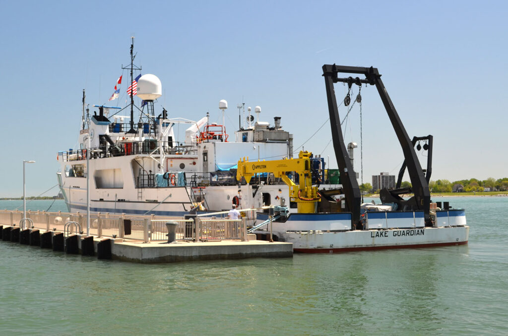
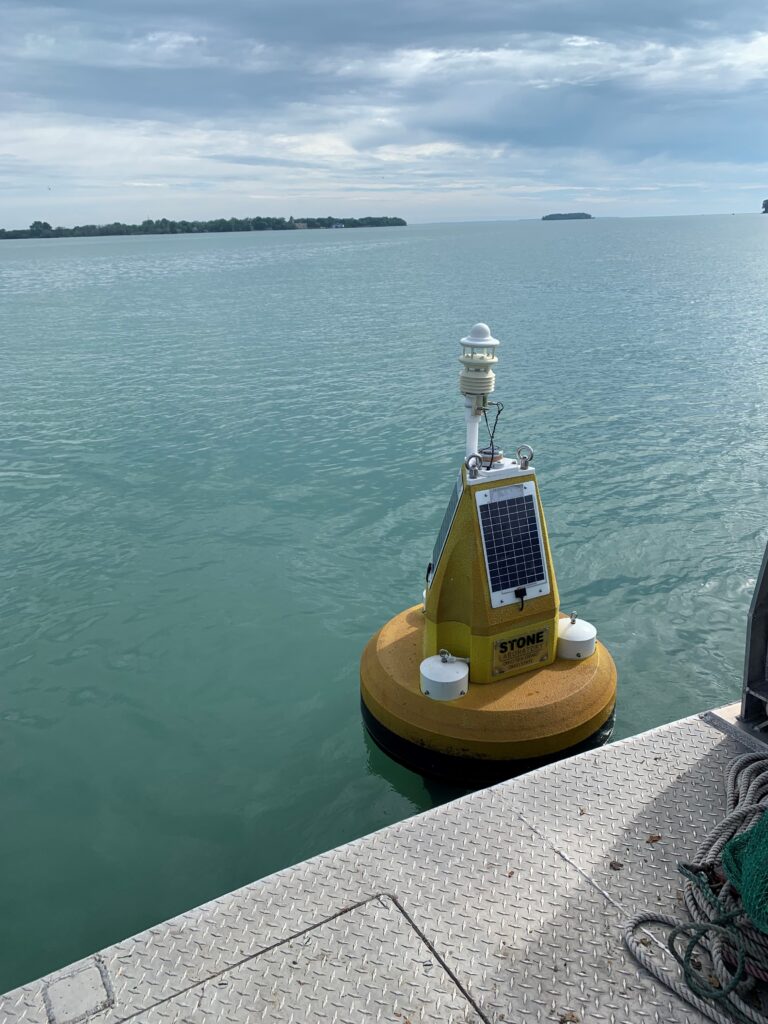
- We begin by challenging students to think about how water quality data is currently collected; leading us to an explanation of water buoys. Buoys are floating sensor platforms, known for their versatility and being relatively easy to deploy and maintain. Buoys can be left free-floating to drift with the lake currents or be anchored to the lakefloor to float at the surface or underwater, depending on where they need to take measurements.
- Connect the use of buoys to the term “observational data”. In the call-out box below, we define observational data as data that is collected by recording events, behaviors, or phenomena as they occur naturally, without interference or manipulation. Using buoys as a data collection device gives scientists the ability to acquire data in this manner. Depending on how they are configured, buoys can monitor physical, chemical, and biological parameters of water and weather including wind speed, water temperature, wave height, pH, chlorophyll, and turbidity.
Observational Data
Data that is collected by recording events, behaviors, or phenomena as they occur naturally, without interference or manipulation.
An example is data collected by a buoy.
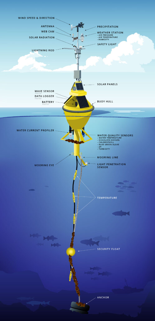
- Using a graphic of a buoy submerged in a lake such as the one in the graphic above, ask students to “put on their imaginary wet suit” so they can swim from the bottom of a buoy to the surface of the water.
- What might they experience as they journey vertically through the water column? While under water, students may note temperature and light differences, fish or other aquatic organisms, a concrete anchor at the bottom of the buoy, a vertical mooring line, subsurface floats to keep the mooring line out the mud, and water sensors.
- As they emerge from the water, students may notice a large floating hull made of foam or fiberglass, weather sensors to take measurements of atmospheric conditions, solar panels to power the sensors, data loggers and communication systems to transmit data, and perhaps a safety light to alert boaters of the buoy’s location. The Great Lakes Observing System (GLOS) “Use of Buoys on the Great Lakes” web resource provides useful information, imagery and video for students about the use of buoys on the Great Lakes. This resources is linked in materials.
- Buoys help researchers, beachgoers, anglers, water treatment plant managers, boaters, and others make informed decisions about their interactions with water systems. In the Great Lakes region, it takes a community of dedicated professionals to monitor and care for the buoys, deploying them every spring and recovering them every fall. Allow students to watch the GLERL “Buoy Prep” video about buoy deployment on the Great Lakes linked in materials.
- Touch base with the “Driving Question Board” provided in the teacher resource section of this lesson debrief student understanding of water buoys.
Explain Part Two
Buoys provide us with data. Data is organized into graphs, tables and charts. During this phase of the learning cycle, we will look at our driving question and anchoring phenomenon through a mathematical lens using buoy data that has been graphed and provided to us from Great Lakes Observation Systems (GLOS).
- Begin with a brief discussion about how graphs, tables, and charts help organize data, including observational data from buoys. Tailor the discussion to meet the specific needs of your students and their level of familiarity with graphing data. Perhaps your students are beginning to understand the differences between tables and graphs. (Developing Concept: Graphs vs. Tables) Discussion questions may include:
- How are tables of data helpful to our understanding of science?
- How are graphs of data helpful to our understanding of science?
- What makes a table more helpful than a graph?
- What makes a graph more helpful than a table?
- Use a “Slow Reveal” technique to introduce students to the graph entitled “Saginaw Bay Buoy Data”. This graph is part of the GLOS “Graphical Analysis Group Activity” student worksheet. Using a “Slow Reveal” technique allows the instructor to slowly reveal small elements of the graph paired with discussion and conjecture about the context of the graph. “Slow Reveals” help promote engagement with the data and allow students to more easily make sense of data. “Slow Reveal” slides for the following frames can be found in materials. More information about “Slow Reveal” graphs is also linked in materials. Here is a potential storyline and reveal pattern for this particular graph:
- Ask students to imagine a buoy floating in a lake while collecting water data. Reveal the first frame of the graph and ask students what they notice and what is missing. (The collection period was in late June to late August of 2023. Time is not recorded. We don’t know where data was collected and we don’t know what parameter was being measured.)
- Reveal the second frame of the graph and ask students what they notice and what is missing. (The temperature is being measured in Celsius. We don’t know if it is air temperature or water temperature. *Note: We actually will never find out if it’s air or water temperature, so we must assume it’s water temperature. The temperature range is from 0-30°C which we can convert to 30-86° F. We still do not know where the buoy was located during data collection.)
- Reveal the third frame of the graph and ask students what they notice and what is missing. (We can now see that we are also measuring chlorophyll in RFU although we may not know what RFU stands for [relative fluorescence units] The units for chlorophyll range from zero to 5 in increments of 0.5. We still do not know where the buoy was located during data collection.)
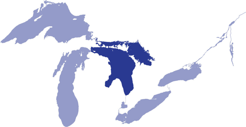
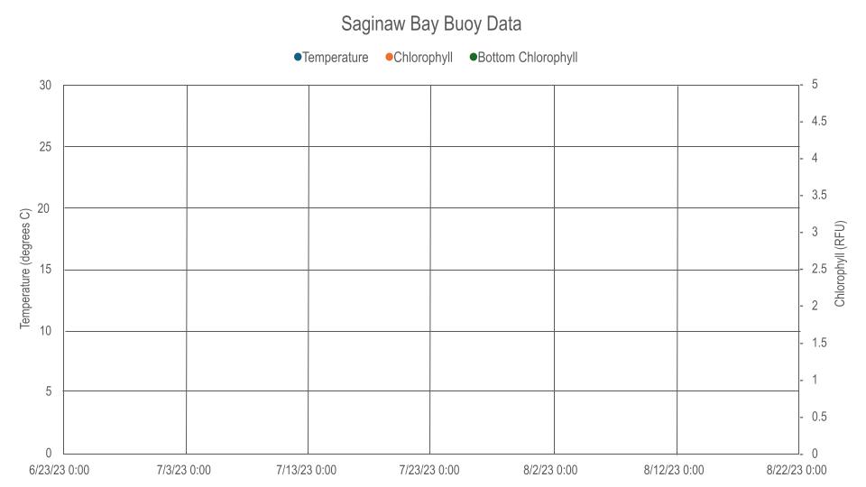
- Reveal the fourth frame of the graph and ask students what they notice and what is missing. (We know the data was collected in the Saginaw Bay. Provide students with access to a map to locate this body of water and note that it is part of Lake Huron. We also know that in addition to temperature and chlorophyll, the buoy also collected bottom chlorophyll.)
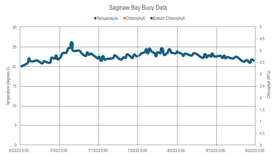
- Reveal the fifth frame of the graph and ask students what they notice and what is missing. (The temperature data has been added to the graph as a line graph.The temperature stays consistently between 20 and 25°C with a slight increase in early July. The warmest consistent temperatures occurred in late July and early August. We do not see data for chlorophyll or bottom chlorophyll.)
- Reveal the sixth frame of the graph and ask students what they notice and what is missing. (We can see the data for chlorophyll and bottom chlorophyll.)
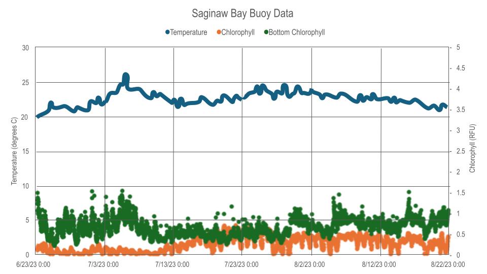
- After engaging with the data through the slow reveal process, students can try to derive meaning from the graph. Provide each student with a copy of the “GLOS Graphical Analysis Group Activity” student pages. Organize students into small groups to complete questions. The activity includes opportunities for students to share their findings with the whole class using an “ambassador speaker.” An answer key has been provided in the Additional Teacher Resources section of the lesson.
- Ask students to imagine a buoy floating in a lake while collecting water data. Reveal the first frame of the graph and ask students what they notice and what is missing. (The collection period was in late June to late August of 2023. Time is not recorded. We don’t know where data was collected and we don’t know what parameter was being measured.)
Explain Part Three
We conclude our analysis of GLOS buoy data with an opportunity for students to work independently, in pairs or small groups with two additional graphs. It is at the discretion of the teacher to determine if students need a “Slow Reveal” process before engaging with the graphs. We are also including two additional resources to help students (and educators) better understand the content surrounding hypoxia. The first resource explains the relationship between dissolved oxygen and temperature. The second is a pond and stream study guide that will help students interpret physical and chemical factors.
Provide each student with a copy of each of the following documents linked in materials.
- Student page titled “Michigan GLOS Data Analysis Independent Practice”
- Dissolved Oxygen and Temperature Fact Sheet from the Cooperative Lakes Monitoring Program
- Pond and Stream Study Guide- Interpreting Physical and Chemical Factors from the Pennsylvania Fish and Boat Commission
Engage with students as a whole class by debriefing this activity together. Help students refine their thinking by revisiting your driving question board as you try to make connections between how land use impacts water quality.
Extend
As we begin to elaborate on the driving question of this lesson, How do our local land use practices impact life in the Great Lakes?, we try to make the connection with students between what is happening in the surrounding watershed to algal blooms and hypoxia in the water. Understanding and even making predictions about these connections is difficult. We localized the issue by studying the Rifle River, a specific area in our watershed where agricultural land use coincided with hypoxic events in Saginaw Bay. We encourage educators to localize the remainder of this lesson. The following activities outline how we proceeded to learn about land use and its impact on water near the Rifle River where it drains into the Saginaw Bay.
- Allow students to study their watershed using “How’s My Waterway?”, an online and interactive tool provided by the Environmental Protection Agency (EPA). “How’s My Water Way?” and an additional imformation resource are located in materials.
- After students familiarize themselves with their watershed and the parameters provided by the “How’s My Waterway?” tool, we use a GIS map showing watershed basins of Michigan. This will enable students to look more closely at our local watershed around the Rifle River. Our “Saginaw Bay GIS Map” is located in materials.
- Use the search bar by entering “Rifle River”. This will lead students to the mouth of the Rifle River where it meets Lake Huron in Saginaw Bay. Place a “Map Note” here by clicking on the map note tool.
- Use the search bar again by entering “Rifle River Recreation Area”. Place another “Map Note” here as this is a testing site for water quality at the headwaters.
- Use the search bar again by entering “Irons Park West Branch” Place another “Map Note” here as this is a second water quality testing site.
- Measure the distance from the headwaters of the Rifle River to the mouth. Also measure the distance from the headwaters of the west branch of the Rifle River to where it meets the main branch of the Rifle River. These measurements will be an approximation in miles as it is difficult to measure with the measuring tool. First click on the measuring tool then choose linear miles. Then go to the map and click on the head waters and trace the river leaving points as it meanders through the watershed. Allow students to agree up and record measurements on a white board.
- Approximate miles of the West Branch of the Rifle RIver_______
- Approximate miles of the Rifle River _______
- Approximate miles total _________
- Ask students to analyze how people use the land around the Rifle River. (primarily agriculture).
- Ask students to analyze the area of water where the Rifle River drains into Saginaw Bay.
- Allow students to change the basemaps to see how the map changes.
- Are there different basemaps that would make measuring easier?
- Is there a particular base map that students find more useful?
- Now change the basemap to “NAIP Imagery Hybrid”.
- Look for the headwaters of the Rifle River, the headwaters of the west branch of the Rifle River, and the mouth of the Rifle River as it enters Saginaw Bay in Lake Huron.
- Discuss land use and the appearance of the water in the Saginaw Bay.
- At this point in the lesson, authors felt it necessary to share with students, “Status of the Lower Food Web in the Offshore Waters of the Laurentian Great Lakes”, a document provided by the EPA, to add to their thinking. This resource is in materials.
- After exploring the watershed digitally, students visit the two locations to complete water quality testing. Students will spend a day collecting water quality data, mirroring the parameters collected by the buoys.
- Find our preferred water quality protocol, “H2O Q in the Classroom,” here. | LINK
- Other testing kits include those produced by companies such as LaMotte or Hach.
- Find our testing parameters and analysis in the following student data sheet. | LINK
- For benthic macroinvertebrate monitoring, Stroud Water Research Center has many resources including the following.
Evaluate
Complete the learning cycle with a final look at the Driving Question Board. If you chose to collect water quality data in your watershed with students this is a good opportunity to compare findings to buoy data. Students can also review the data they collected using their new understanding of stream quality to draw conclusions about the health of the tested streams. They can analyze how local land use affects water quality.
Bring students attention back to the photo and notes taken during the Engage portion of this learning cycle. Examine the photo of water that is bright green. The camera zooms in on a dead fish that has washed up on the shore. The bright green color of the water is an indication that a harmful algal bloom has occurred. The photographer took this photo in one of the Great Lakes, capturing a Channel Catfish (Ictalurus punctatus). Review the original notes taken when students first viewed the photo. Allow students to discuss how their thinking has changed as a result of this lesson.
Students can share their learning by developing presentations to share with local audiences highlighting ways to positively impact their local watershed. These presentations might include Story Maps, slide shows, poster boards, and more.
Additional Resources
The following list includes additional resources we wanted to share to help educators and students deepen their understanding of our driving question, “How do our local land use practices impact life in the Great Lakes?” as well as effective ways to communicate scientific ideas to others.
- Find information about local land use in this NOAA Digital Coast tool. | LINK
- Model different land use (not specific to any area). | LINK
- Tool for developing effective science communication. | LINK
- Cyanobacteria Algal Bloom from Satellite in Saginaw Bay, MI – NCCOS Coastal Science Website | LINK
- GLOS YouTube Channel | LINK
- Video: 2024 University of Minnesota-Duluth: Meteorological Buoy Deployment | LINK
Lesson Publication Date: Teaching Great Lakes Literacy Cohort 1, 2025.
Lesson Authors:
- Educators from Ogemaw Heights High School | LINK
- Dominic Goulette, Math Educator
- Chris Powley, Science Educator
- Scientists from Great Lakes Observing System | LINK
- Shelby Brunner, Science and Observations Manager
- Katie Rousseau, Strategic Initiatives Manager
- Center for Great Lakes Literacy
- Program Lead: Meaghan Gass, Extension Educator, Michigan Sea Grant
- Program Lead: Brandon Schroeder, Senior Extension Educator and Education Co-leader Michigan Sea Grant
- Program Lead: Angela Scapini, Extension Educator, Michigan Sea Grant
- Editor: Angela Greene, Digital Enhancement Consultant, Michigan Sea Grant
- Designer: Todd Marsee, Multimedia Designer / Photographer, Michigan Sea Grant
Teaching Great Lakes Literacy (TGLL)
Teaching Great Lakes Literacy (TGLL) connects math, science, and other educators with scientists to create and pilot lessons centered around Great Lakes-focused topics and current research. This project was funded by the Great Lakes Fishery Trust with support from the Center for Great Lakes Literacy and MiSTEM Network.